Transforming a living environment from mundane to magnificent requires more than simply purchasing furniture and hanging artwork on walls. The art of interior brightening encompasses a sophisticated understanding of how light interacts with colour, how textures influence perception, and how strategic design choices can fundamentally alter the emotional resonance of any room. Whether you’re grappling with a north-facing bedroom that never seems to capture adequate daylight or a compact urban apartment where every square metre demands careful consideration, the principles of spatial enhancement remain remarkably consistent. The difference between a space that feels oppressive and one that radiates warmth and welcome often comes down to deliberate, informed decisions about materials, placement, and chromatic selection. Modern interior design has evolved beyond aesthetic considerations alone, now incorporating psychological research, biophilic principles, and technological innovations that allow for unprecedented control over how we experience our domestic environments throughout the changing hours of each day.
Biophilic design principles for creating Nature-Inspired interior atmospheres
The human connection to natural environments runs deeper than aesthetic preference—it’s hardwired into our evolutionary psychology. Biophilic design recognises this fundamental relationship and leverages it to create interiors that don’t merely look attractive but actively improve wellbeing, reduce stress, and enhance cognitive function. Research consistently demonstrates that exposure to natural elements within built environments correlates with measurable improvements in mood, productivity, and even recovery rates from illness. This isn’t about simply placing a potted plant on a windowsill; rather, it involves a systematic integration of natural materials, living organisms, natural light patterns, and organic forms throughout your spatial design. The most successful biophilic interiors create what designers call “prospect and refuge”—spaces that simultaneously offer open views and protected enclosures, mimicking the savannah landscapes where human consciousness first evolved.
Integrating living plant walls and vertical gardens into compact urban spaces
When horizontal space proves limited, thinking vertically opens remarkable possibilities for introducing botanical elements. Living walls transform previously neglected vertical surfaces into thriving ecosystems that purify air, regulate humidity, and provide constantly changing visual interest. Modern vertical garden systems have become increasingly accessible, with modular panel designs that accommodate everything from low-maintenance succulents to lush ferns and trailing pothos varieties. The key consideration involves selecting plant species appropriate to your specific light conditions—shade-tolerant varieties for dimmer spaces, whilst sun-loving specimens thrive near south-facing windows. Installation typically requires either a hydroponic system with integrated irrigation or individual pockets filled with lightweight growing medium, both approaches offering distinct advantages depending on your maintenance preferences and structural considerations.
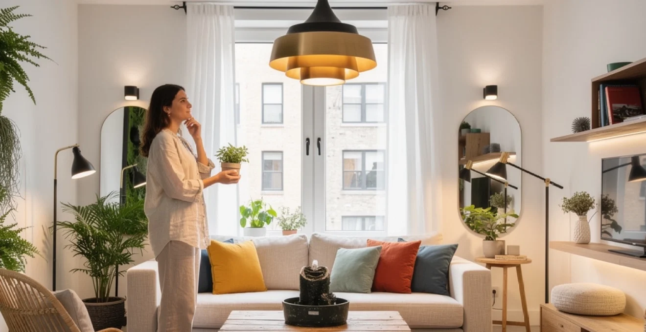
Natural light optimisation through strategic mirror placement and window treatments
Mirrors function as architectural magic, effectively doubling perceived space whilst multiplying available light throughout a room. The strategic positioning of reflective surfaces opposite or adjacent to windows captures incoming daylight and redistributes it to previously shadowed corners, dramatically brightening interiors without electrical intervention. Large-scale mirrors create the most pronounced effect, though even smaller decorative pieces contribute meaningfully when positioned thoughtfully. Consider placing a substantial mirror directly opposite your primary window to maximise light reflection, or angle mirrors to capture light from skylights and redirect it horizontally across ceilings. Window treatments deserve equally careful consideration—heavy, dark curtains absorb light and visually contract space, whilst sheer fabrics in neutral tones allow maximum light penetration whilst maintaining privacy. Layered window dressing combines sheer panels for daytime use with heavier curtains that can be drawn during evenings, offering flexibility that responds to changing needs throughout the day.
Incorporating organic materials: rattan, jute, and reclaimed wood elements
Natural materials bring inherent warmth and textural complexity that synthetic alternatives struggle to replicate. Rattan furniture, with its distinctive woven patterns and honey-toned colouration, introduces organic geometry and tactile interest whilst remaining remarkably lightweight—a significant advantage in smaller spaces where furniture may need regular repositioning. Jute rugs provide underfoot texture that feels substantial without visual heaviness, their neutral beige tones serving as perfect canvases for bolder colour accents in cushions and throws. Reclaimed wood elements—whether as floating shelving, coffee table surfaces, or decorative wall panels—carry historical character through visible grain patterns, natural imperfections, and weathered patinas that mass-produced furniture
developed lack. When specifying reclaimed timber, ensure it has been properly treated and sealed; this preserves its character while preventing splinters, warping, or insect damage. In compact spaces, even a single reclaimed wood console table paired with a jute runner and rattan basket can anchor the room, proving that a nature-inspired interior atmosphere does not require a complete overhaul to feel authentic and uplifting.
Water features and desktop fountains for enhanced ambient acoustics
While we often prioritise what we see in a room, what we hear has an equally powerful impact on how a space feels. Subtle water features and desktop fountains introduce a gentle, continuous soundscape that can mask urban noise, much like white noise machines but with a more organic character. Studies on restorative environments have shown that natural sounds such as flowing water reduce perceived stress and improve focus, making these elements especially beneficial in home offices and living rooms where you need to relax or concentrate.
When incorporating a water feature to brighten a space, scale and placement are crucial. In small rooms, opt for compact desktop fountains in stone, ceramic, or glass that sit comfortably on a sideboard or console without visually cluttering the surface. Place them away from electronic equipment, ideally near plants or natural materials so the fountain feels integrated into a wider biophilic composition rather than a standalone gadget. As with all multisensory décor, moderation works best—you want a soft murmur of water, not the roar of a miniature waterfall dominating your interior.
Colour psychology and chromatic theory in spatial enhancement
Colour is one of the most powerful tools for transforming an interior, often achieving more than furniture or accessories in terms of perceived brightness and spaciousness. Chromatic theory helps us understand why cool blues seem to recede while warm terracottas appear to advance, and how these effects can be harnessed to correct awkward proportions or low natural light. Psychological research confirms that specific hues influence mood and behaviour: soft greens are calming and restorative, yellows feel optimistic and energising, and neutrals create a sense of clarity and order. By treating your walls, ceilings, and textiles as an interconnected palette rather than isolated choices, you can craft a cohesive scheme that supports how you want to live, work, and unwind in each room.
Implementing the 60-30-10 colour rule for balanced visual harmony
The 60-30-10 colour rule offers a simple yet remarkably effective framework for creating balanced interiors that feel bright but not chaotic. In essence, 60% of the room is your dominant colour (typically walls and large surfaces), 30% is a secondary colour (often furniture and large textiles), and 10% is reserved for accent tones in cushions, art, and small accessories. This proportional approach ensures that even when you introduce bold or saturated hues, they remain grounded in a harmonious context rather than overwhelming the senses.
To brighten a dark room using the 60-30-10 rule, consider a soft off-white or pale greige as your 60% base, a gentle pastel like muted sage or powder blue as your 30%, and a more vivid tone—perhaps ochre, coral, or teal—for your 10% accents. This structure allows you to experiment with colour while maintaining a cohesive visual rhythm, much like a piece of music that balances melody, harmony, and percussion. If you love deep colours but fear they will make your space feel smaller, confine them to the 10% slice of the pie in the form of artwork, lampshades, and decorative objects, giving you the emotional impact without sacrificing lightness.
Warm versus cool palettes: impact on perceived room dimensions
One of the most practical aspects of colour psychology is its ability to alter how we perceive the dimensions of a room. Warm palettes—think soft terracotta, warm taupe, and creamy neutrals—tend to visually advance, making surfaces appear closer and the space feel more intimate. Cool palettes—dusty blues, gentle greys, and sage greens—recede, creating an impression of greater depth and openness. If you have a long, narrow room that feels like a tunnel, painting the far wall in a warm, deeper shade can visually bring it closer, balancing the proportions and making the space feel more harmonious.
Conversely, for small or low-ceilinged rooms that feel oppressive, cool, light-reflective colours on walls and ceilings can enhance the sense of vertical and horizontal expansion. You might paint the walls a pale blue-grey while using an even lighter tone on the ceiling to suggest height, much like a sky stretching above a horizon. When choosing between warm and cool palettes to brighten any space, let orientation guide you: north-facing rooms often benefit from warmer undertones to counteract grey light, while south-facing rooms can comfortably accommodate cooler hues without feeling cold.
Accent walls using farrow & ball and little greene heritage colours
Accent walls remain a powerful, cost-effective strategy for injecting personality and depth into a room without committing to full saturation. Heritage paint brands such as Farrow & Ball and Little Greene offer complex, pigment-rich colours that change subtly throughout the day, enhancing the dynamic play of light in your interior. Rather than choosing the loudest shade in the fan deck, focus on tones with nuanced undertones—muted blues, smoky greens, or dusky pinks—that complement the rest of your palette while creating a focal point.
To brighten a space with an accent wall, position it opposite your main source of natural light so it can bounce soft colour back into the room. A Farrow & Ball shade like “De Nimes” on a chimney breast, paired with lighter surrounding walls, can add sophistication without closing in the space. Similarly, a Little Greene hue such as “French Grey Pale” on a single wall behind a sofa will ground the seating area while keeping the overall ambience airy. Think of the accent wall as a visual exclamation mark: used sparingly, it draws the eye and adds structure, helping to define zones within open-plan layouts.
Pantone colour trends and their application in contemporary décor schemes
Pantone’s annual Colour of the Year and seasonal trend forecasts often set the tone for fashion and interiors alike, but they need not be followed slavishly to be useful. Instead, treat Pantone trends as a curated insight into emerging moods—whether that’s a shift towards restorative greens, optimistic yellows, or soulful blues—and integrate them in ways that support the long-term character of your home. Since interior updates move more slowly than wardrobe changes, it’s wise to use trend-driven colours mainly in elements that can be swapped out easily, such as cushions, throws, lampshades, or occasional furniture.
For example, if a vibrant coral or digital lavender dominates the trend conversation one year, you might introduce it through artwork, a statement vase, or a single upholstered chair rather than painting all four walls. This approach lets you enjoy the freshness of contemporary décor schemes while ensuring your core palette remains timeless and adaptable. Over time, you can build a “capsule” collection of accessories in various trending hues, rotating them seasonally to refresh and brighten your space much like adjusting your wardrobe from winter to summer.
Layered lighting techniques for multi-functional space transformation
As our homes increasingly serve as places to work, relax, exercise, and entertain, lighting design has become a critical factor in making spaces truly versatile. Rather than relying on a single ceiling fixture, layered lighting combines ambient, task, and accent sources to create a flexible toolkit that you can adjust throughout the day. This approach not only brightens a room in a literal sense, it also enhances atmosphere and supports eye comfort—important when many of us log long hours on screens. Think of lighting as the stage direction for your décor: the same furniture and colours can feel crisp and energising at one moment, then soft and cocooning later, simply through a shift in illumination.
Kelvin temperature selection: 2700K to 5000K for mood modulation
Understanding Kelvin temperature helps you choose bulbs that support the mood and function of each zone. Lower colour temperatures around 2700K to 3000K emit a warm, golden light similar to traditional incandescent bulbs, ideal for living rooms and bedrooms where you want to relax. Mid-range temperatures between 3500K and 4000K feel neutral and are well-suited to kitchens, dining areas, and bathrooms, striking a balance between clarity and comfort. Higher temperatures from 4500K to 5000K mimic daylight and can be beneficial for home offices or studios where accurate colour rendition and alertness are priorities.
Smart bulbs make Kelvin selection even more versatile, allowing you to shift from cool, energising light during work hours to warm, restful tones in the evening with a tap on your phone. This dynamic control can be particularly transformative in spaces that lack natural daylight, helping you “fake” a circadian rhythm by modulating light quality across the day. When planning how to brighten a dark room with artificial lighting, consider mixing bulb temperatures strategically—for instance, warm table lamps for ambience and cooler under-cabinet LEDs for precise tasks—rather than using a single tone everywhere.
Statement pendant fixtures from tom dixon and flos collections
Statement pendants operate as both functional lighting and sculptural art, instantly elevating the perceived sophistication of a room. Designers such as Tom Dixon and Flos offer collections that combine striking forms with high-quality illumination, from mirrored orb pendants that reflect their environment to minimalist diffusers that cast a soft, even glow. In a living room or dining area, a well-chosen pendant can serve as the visual anchor around which you arrange furniture, keeping the space feeling cohesive even when layout constraints are tricky.
When selecting a statement pendant to brighten your space, consider both scale and transparency. Oversized fixtures can be surprisingly effective in small rooms, adding drama and focus, provided they are hung at the correct height and do not block sightlines. Glass or perforated metal shades allow light to filter through and dance across nearby surfaces, creating an ever-changing interplay of highlights and shadows. For low ceilings, look for shallow drum pendants or linear fixtures that distribute light widely without hanging too low, ensuring you gain both style and practicality.
LED strip lighting and smart dimming systems for atmospheric control
LED strip lighting has evolved from a purely functional tool into a key component of atmospheric interior design. Discreet strips hidden under shelves, along coving, or behind headboards provide soft, indirect illumination that washes walls and ceilings in a gentle glow, eliminating harsh shadows and visually expanding the space. Because LEDs are highly energy-efficient and generate little heat, they are ideal for continuous use in areas you want to keep gently lit, such as hallways or media units.
Pairing LED strips with smart dimming systems or app-controlled hubs gives you fine-grained control over brightness and, in some cases, colour temperature or hue. Imagine shifting your living room from a bright, cool-lit work zone in the morning to a warm, cinema-like ambience in the evening, all via a preset scene. This flexibility not only enhances comfort but can also improve energy efficiency by allowing you to use just enough light where and when you need it. For renters or those decorating on a budget, adhesive LED strips placed behind a sofa or along a shelving unit offer a significant boost in perceived brightness with minimal installation hassle.
Task lighting integration with anglepoise and artemide designs
Task lighting is essential for activities that demand focused illumination—reading, cooking, studying, or crafting—and when done well, it contributes to the overall brightness and functionality of a room. Iconic brands such as Anglepoise and Artemide have refined the art of adjustable task lamps, offering designs that are both ergonomically precise and aesthetically pleasing. A well-placed Anglepoise lamp beside an armchair can transform an underused corner into a favourite reading nook, while an Artemide desk light with adjustable arms and dimming options can make long work sessions more comfortable and less straining on the eyes.
To integrate task lighting effectively, think in layers rather than isolated islands of brightness. Combine ceiling or wall-mounted ambient light with directionally adjustable lamps that you can pivot as needs change, much like spotlights on a stage. In small spaces, clamp-on or wall-mounted task lights free up valuable surface area while still delivering targeted illumination exactly where you need it. Ultimately, your goal is to ensure that every frequently used activity zone—desk, sofa, kitchen worktop—has its own dedicated, flexible light source that supports both productivity and visual comfort.
Textural contrast and tactile layering strategies
Even the most carefully curated colour palette can fall flat if every surface in a room shares the same texture or sheen. Textural contrast introduces depth, interest, and a sense of richness, making even a neutral scheme feel inviting and multidimensional. Our brains interpret tactile variety as a sign of complexity and comfort, much like a well-composed piece of music relies on both rhythm and melody. By layering soft and hard, matte and glossy, smooth and nubbly materials, you can brighten a space not only visually but also emotionally, encouraging people to reach out, touch, and linger.
Combining velvet, linen, and boucle fabrics for dimensional depth
Fabrics are one of the most accessible ways to experiment with textural layering without major structural changes. Velvet brings a subtle sheen and depth of colour that can make even a dark hue feel luminous as it catches the light at different angles. Linen, by contrast, offers a relaxed, breathable texture with a slightly crumpled character that reads as approachable and lived-in. Boucle, with its looped, almost cloud-like surface, introduces softness and visual interest, particularly on armchairs, pouffes, or cushions.
To prevent a small room from feeling heavy, distribute these fabrics strategically across the space. You might pair a linen slipcovered sofa with velvet accent cushions and a single boucle armchair, allowing each texture to play a distinct role. Keeping the colour palette relatively tight—variations of ivory, stone, and soft greige, for instance—lets the tactile differences take centre stage without visual clutter. The result is a room that feels layered and luxurious, even if the underlying furniture arrangement remains simple.
Moroccan berber rugs and persian kilims as focal anchors
Flooring occupies a huge visual footprint in any room, making it a prime candidate for adding texture and pattern that can brighten your interior design. Moroccan Berber rugs, with their thick pile and often neutral backgrounds punctuated by geometric motifs, create an inviting, cocooning effect underfoot. Persian kilims, by contrast, are typically flatwoven and richly patterned, bringing colour and artisanal detail without adding bulk—an advantage in compact living rooms or under dining tables where chair movement is frequent.
Using a statement rug as a focal anchor helps define zones and ground furniture arrangements, especially in open-plan layouts where spatial boundaries are otherwise blurred. Positioning a Berber rug under a seating group, for example, visually “collects” the sofa, armchairs, and coffee table into a coherent island of activity. A Persian kilim in a hallway or home office can inject energy and personality, drawing the eye through the space and encouraging a sense of flow. In darker rooms, choose rugs with lighter backgrounds or warm, sunlit tones to reflect more light and counteract any gloom.
Mixed-metal accents: brass, copper, and matte black finishes
Metallic accents operate like jewellery in interior design, adding sparkle, contrast, and a sense of refinement. Mixing metals—such as warm brass, rosy copper, and grounding matte black—can make a space feel curated rather than matchy-matchy, provided the combinations are intentional. Brass and copper bounce light around a room thanks to their reflective qualities, subtly brightening surfaces and echoing the glow of nearby lamps or candles. Matte black, used sparingly, introduces definition and depth, much like eyeliner frames and enhances the eye.
To keep mixed metals cohesive, select one dominant finish and support it with one or two secondary accents. For instance, you might choose brass for curtain poles and table lamps, add a copper tray or vase on the coffee table, and use matte black for door handles or picture frames. Repeating each finish at least twice in the room helps them feel integrated rather than accidental. This approach works particularly well in neutral or monochrome schemes, where metallics become the primary source of visual excitement and luminosity.
Curated art displays and gallery wall composition methods
Art has a unique ability to inject personality, narrative, and colour into a room, often becoming the focal point that ties disparate elements together. A well-curated display can brighten a space not only through vivid hues but also by drawing the eye upward and outward, expanding perceived dimensions. Whether you favour abstract canvases, black-and-white photography, or a mix of prints and personal mementoes, the key is to approach your walls as a composition rather than a random assortment. Just as a museum curator arranges works to guide visitors through an exhibition, you can orchestrate your artwork to lead the gaze around the room and highlight architectural features.
Gallery walls remain popular because they allow you to tell a layered story and adapt the display over time. Start by laying your pieces on the floor to experiment with groupings, aiming for a balance of sizes and visual weights. A common method is to anchor the arrangement around one or two larger works, then fill in with smaller pieces, maintaining consistent spacing of 3–5 centimetres between frames. Hanging the centre of the composition roughly at eye level—around 145–155 centimetres from the floor for most adults—ensures comfort and coherence, even when ceilings are high.
For rooms that need brightening, incorporate artwork with lighter backgrounds, dynamic movement, or optimistic colour palettes. Consider how frames contribute to the overall effect: white or light wood frames can feel fresh and contemporary, while thin black frames add definition without overwhelming the art. If you prefer a more minimal look, a single oversized piece placed on a large, blank wall can be just as impactful as a gallery wall, especially when lit by a picture light or strategically positioned floor lamp that celebrates it as a centrepiece.
Multisensory décor elements: aromatherapy diffusers and acoustic treatments
While visual elements often dominate interior conversations, genuinely uplifting spaces engage all the senses. Scent and sound, in particular, exert a powerful yet often subconscious influence on how we perceive comfort, brightness, and wellbeing at home. Aromatherapy diffusers, carefully chosen candles, and subtle acoustic treatments can transform an otherwise ordinary room into a sanctuary that feels both energising and calming, depending on your needs. Think of these multisensory layers as the finishing notes in a perfume: invisible yet essential to the overall impression.
Aromatherapy diffusers allow you to tailor the olfactory atmosphere to the time of day or function of the room. Citrus and herbal blends—orange, grapefruit, rosemary—feel invigorating in kitchens or home offices, supporting focus and creativity, while lavender, chamomile, or sandalwood are better suited to bedrooms and living rooms where relaxation is the aim. Ultrasonic diffusers double as small humidifiers, which can be particularly welcome in centrally heated homes where dry air can feel harsh. Position diffusers away from direct sunlight and high-traffic areas to distribute aroma evenly without overwhelming the senses.
Acoustic treatments need not resemble recording studios; many design-led options integrate seamlessly into stylish interiors. Thick curtains, upholstered furniture, and plush rugs already contribute to sound absorption, but you can go further with fabric-covered wall panels, acoustic art prints, or even strategically placed bookcases that break up echo. In open-plan spaces, soft partitions or textile room dividers help delineate zones while dampening noise, making it easier to work, converse, or watch films without distraction. By refining both the scent and sound of your home, you create an environment that feels brighter in a holistic sense—clearer, calmer, and more attuned to how you actually live each day.